Design
HKU Map by Votes
- Public Art by Phoebe Man
(HKU
Graduate House Artist-in-Residence Programme)
Location: The Trapesium, Level
P4 Foyer, Graduate House, No.3 University Drive, The University of Hong Kong
Exhibition Period: 10/4/2006 – 26/5/2006

| The
University of Hong Kong (HKU) is now planning the Centennial Campus and asking
for advice. What is an ideal campus? How to make people love the campus? Phoebe
Man’s public art might be able to provide some of the answers. Her
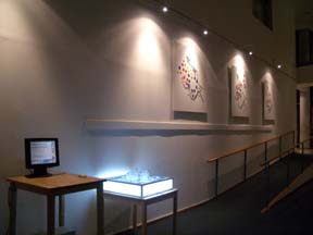
exhibition “Design HKU Map by Vote” is now showing in the Graduate House of HKU.
The show includes 2D works, a 3D work and a web art.
To make the audience easier to recognize the places on the map, she transformed the commonly used HKU map. She followed the Gestalt psychology and grouped the space. The new map has more open spaces and playgrounds. It also has classrooms, libraries and canteens. She also followed the preference of the students (such as spacious) and designed several maps. The centers of maps are always the open spaces and the gardens. <2D
HKU Maps of 05ARCH1011> For
the 3D map, each vote can raise the space up one floor. Although Happy Garden
is a flat space, it is the tallest in the 3D map because it got 15 votes. Audience
can read the reasons of why students love the space on the map. The reasons are
summarized as follows: To
let other people vote and continue to design the HKU map, Phoebe designed a web
version of her work (http://www.cyman.net/hku/)
and audience can go to the web site to vote. They can make a new HKU map together
or make their own maps. Map
looks like an objective tool which shows us the direction. However, it is not
totally objective sometimes. Some countries’ boundary might be different from
others. The name of the places can be different. Some places appeared bigger than
the actual size. Maps sometimes show culture, history and power. Resetting the
map is to emphasize the importance of an individual and the public. It can be
subjective and imaginative. It shows the desire of an individual, the culture
and the memories of a group of people. It can also function as a map to show the
way (what the public want to go) and the position (of the architecture in the
heart of the public). _______________________________________________________________________________________ Artist Statement I was
invited to show my work in the Trapezium of the Graduate House by May Fung , the
curator. The space is a hostel and I want to make some works which is site specific
and public related. Therefore an idea comes up in my mind, doing a survey to see
where the most favorite space of the occupants is and used the result to make
a new map of University of Hong Kong (HKU). I
am looking forward to reading the result of the questionnaires. Since I had worked
in HKU for 4 years, I like the campus too. The result is that students like "Happy
Garden" most, Haking Podium the second, then Lily Pond, Main Building, Library
Building … This
result is a little bit unexpected. The landmark of HKU, Main building, is only
the third favorite space. Outsiders are hard to imagine why Happy Garden, which
has only one old tree and an empty space like Haking Podium could win the heart
of the students. This result shows that the appearance of a space is not the only
factor which makes people like that place. An empty space that could make people
feel free and comfortable could also win the heart of the users. This result is
also reasonable because HKU is a hilly space. Therefore, spacious place is precious. It is nice that I can know HKU better through this information. I want to thank all students for filling in the questionnaires. I also want to thank the audience of the talk. One of the audience said that I made the popular spaces bigger and higher in my new map. However, if the popular space is higher and bigger, it might not be popular anymore. I said it is true. The art work is not practical. It is only a symbol. It put more emphasis on the unaware space and the public. This is also the spirit of public art. There are two kinds of public art. One is the art that put in public space. Another one is the art that shows public views. My work is the latter one. The web version (http://www.cyman.net/hku/) is open. I set the rules. The audience can vote to change the work. The process is the work itself. In theory, it can last and change forever. This natural, live and interactive map is totally opposite to the map in reality. Maps especially city map cannot be changed by ordinary people. They are always in the hand of the institution or the authority and keep distance from the public and the users. We might need to rethink the relationship between the users and the planner. |